It’s fair to say that I don’t follow many sports. I’m more of a casual observer myself and would much rather watch something like the Tour de France or a rugby match now and then.
That being said, I recently came across a post on my Mastodon feed about using Gephi to visualise the relationship between players and their respective clubs and teams for the 2023 FIFA Women’s World Cup.
Naturally, as someone with an interest in graphs and social network analysis, this caught my attention.
Looking at their blog, it turns out that all the data is collected from a Wikipedia article by manually collecting each of the team’s squad and using graph theory to model the relationships between a player with their team and affiliated club.
Why graph theory? Graph theory is really useful as it allows us to examine which players are affiliated with certain clubs and teams. It also allows us to understand ties and mutual connections in greater detail.
Motivation
Since I do a lot of Python scripting and data analytics for my day job, this gave me the motivation to build my own scraper to collect, analyse and visualise the data myself.
After all, it’s just simple web scraping. How hard can it be?
Let’s see how it’s done.
Prerequisites
Before we get to the code, if you’re following along, there are a few packages which need to be installed including networkx, pandas, matplotlib, BeautifulSoup and pygraphviz.
I use pygraphvis as it provides a convenient interface to the graphviz layout engine. It’s really handy for producing some awesome graph visualisations from the command line.
Let’s get started with the code!
The Code
Let’s import some packages.
import requests
import networkx as nx
import pandas as pd
import matplotlib.pyplot as plt
import matplotlib.patches as mpatches
from bs4 import BeautifulSoup
Since we’re scraping data from Wikipedia, let’s get the raw HTML from the article we’re interested in. In this case, we’re scraping squad tables for each of the 32 teams and using BeautifulSoup to parse the HTML.
URL = "https://en.wikipedia.org/wiki/2023_FIFA_Women%27s_World_Cup_squads"
r = requests.get(URL)
soup = BeautifulSoup(r.text)
n_teams = 32
Now that we got the raw HTML, we can start extracting some data. Thankfully, pandas has a built-in feature for converting all the tables into an array of data frames.
It just so happens that the first 32 tables in the HTML refer to each of the squad. This may not be the case for other articles, so check beforehand if you plan to reuse this.
tables = pd.read_html(r.text)
tables = tables[:n_teams]
With the tables scraped, let’s get the name of each team (countries). This is encoded as a h3 tag wrapped around a span tag with the class mw-headline.
Again, we’re taking the first 32.
teams = [t.find('span', class_="mw-headline").text for t in soup.find_all('h3')]
teams = teams[:n_teams]
As the list of squads and team names are in order, we can match them up with a dictionary to make things a little more organised.
team_members = {teams[i]: df for i, df in enumerate(tables)}And now, the complicated part – the visualisation. I’ve really gone to town here to make things pretty.
This function takes the graph produced from networkx and turns it into a visualisation with some help from matplotlib. It also colour-coordinates and sizes different nodes according to their category (player, club or team).
def plot(G, teams, players, clubs, title=None, figsize=(50, 40), label=False, legend=False):
    pos = nx.nx_agraph.graphviz_layout(G, prog='neato')

    plt.figure(figsize=figsize)
    ax = plt.axes()
    ax.set_facecolor("#373737")

    if title:
        ax.set_title(title, y=0.98, x=0.01, pad=-13, loc='left', fontsize=18, color='#FFFFFF', fontweight='bold')

    nx.draw_networkx_nodes(G, pos, nodelist=[t for t in teams if t in G.nodes()], node_size=4000, node_color='#698f33', alpha=0.99)
    nx.draw_networkx_nodes(G, pos, nodelist=players, node_size=500, node_color='#53bdf2', alpha=0.99)
    nx.draw_networkx_nodes(G, pos, nodelist=clubs, node_size=1000, node_color='#eb6184', alpha=0.99)
    nx.draw_networkx_edges(G, pos, arrows=True, connectionstyle="arc3,rad=0.2", edge_color='w', alpha=0.5)

    if label:
        labels = {n: n.replace(' ', '\n') for n in G.nodes}
        nx.draw_networkx_labels(G, pos, labels=labels, font_color='w')

    if legend:
        handles = [
            mpatches.Patch(color='#698f33', alpha=0.99, label='Team'),
            mpatches.Patch(color='#53bdf2', alpha=0.99, label='Player'),
            mpatches.Patch(color='#eb6184', alpha=0.99, label='Club'),
        ]
        plt.legend(handles=handles)

    plt.tight_layout()

    if title:
        plt.savefig(f"plots/{title}.png")

    plt.show()
Here is a quick example by iterating through each team by building and visualising a graph for each individual teams.
Building the complete graph consists of two parts by converting the data frame into a graph using nx.from_pandas_edgelist. One graph for modelling players and clubs and the second for modelling players and teams. These two graphs are then combined to produce a single graph using the nx.compose method.
The combined graph is then visualised using the function above.
for team, df in team_members.items():
    source = 'Player'
    target = 'Club'

    players = set(df[source].unique())
    clubs = set(df[target].unique())

    df['Team'] = team

    Gpc = nx.from_pandas_edgelist(df, source=source, target=target, create_using=nx.Graph)
    Gpt = nx.from_pandas_edgelist(df, source=source, target='Team', create_using=nx.Graph)

    G = nx.compose(Gpc, Gpt)

    plot(G, teams, players, clubs, title=team, figsize=(10, 8), label=True, legend=True)
Using this as an example, this is what an individual graph looks like for Spain.

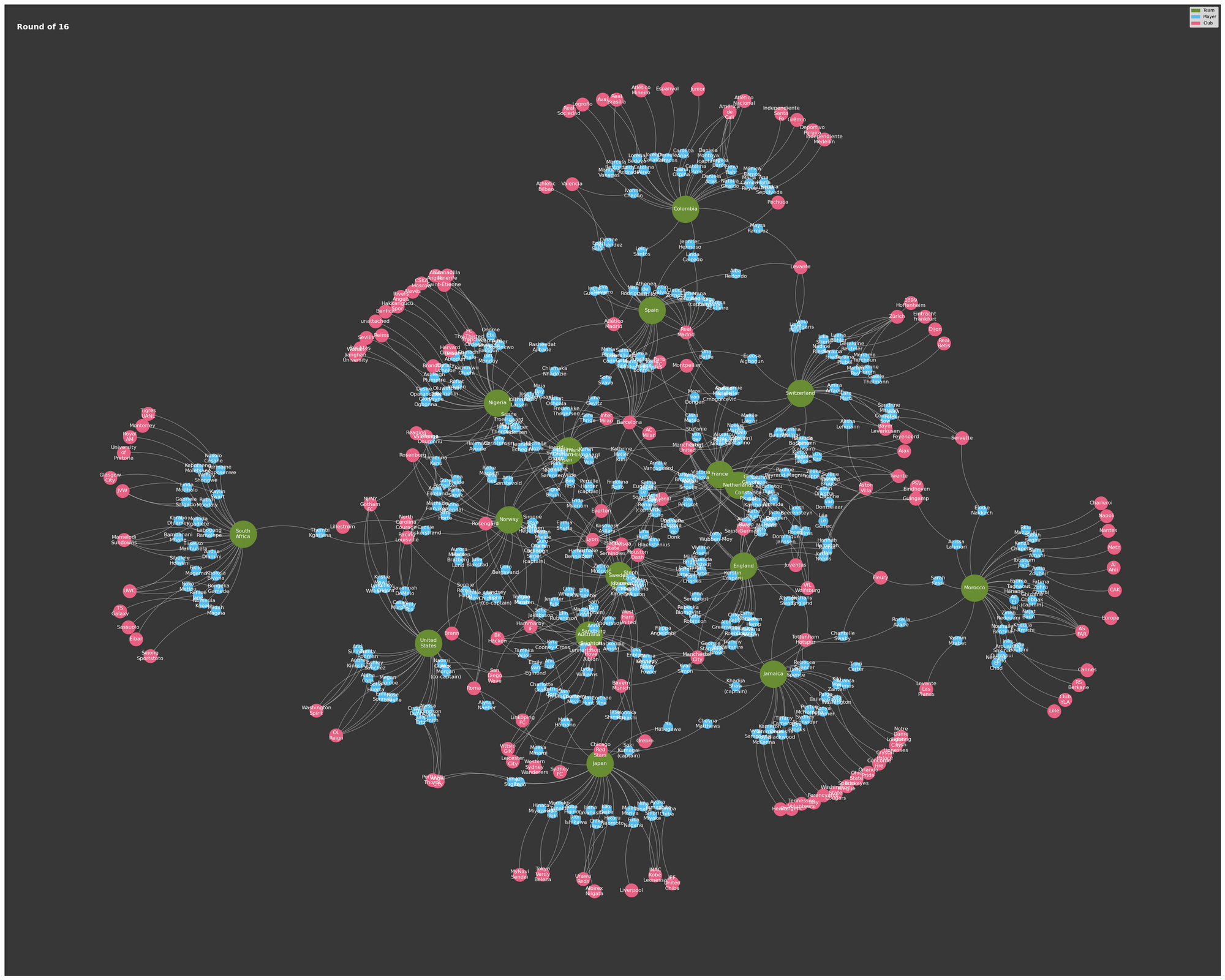
We can expand this further by building a function to combine multiple teams into one. Let’s do this for the teams in the round of 16, quarter-finals, semi-finals and the final. This is achieved by passing a list of teamssub_teams.
def combine(sub_teams, title, figsize):
    G = nx.Graph()
    players = set()
    clubs = set()

    for team in sub_teams:
        df = team_members[team]

        source = 'Player'
        target = 'Club'

        players.update(set(df[source].unique()))
        clubs.update(set(df[target].unique()))

        df['Team'] = team

        Gpc = nx.from_pandas_edgelist(df, source=source, target=target, create_using=nx.Graph)
        Gpt = nx.from_pandas_edgelist(df, source=source, target='Team', create_using=nx.Graph)

        Gg = nx.compose(Gpc, Gpt)

        G = nx.compose(G, Gg)

    plot(G, teams, players, clubs, title=title, figsize=figsize, label=True, legend=True)


Conclusions
As I said at the start of this post, I’m not into football myself but, having been inspired by other people’s work, visualising things as a graph has certainly encouraged me to see things from a completely different perspective.
I find it fascinating to see the relationships between certain players through mutual clubs and teams. For some reason, I just assumed that all players of one club would play for the same team. Apparently not.
I’m certainly interested to see how this can be reused for other sports too.