Being able to visualise your data is an essential part of helping your people understand key concepts derived from your data. In a previous blog post, we covered some of the most widely used and popular Python packages for doing just this.
One thing that these packages lack is the ability to produce dynamic data visuals that can be shared with others and updated in real-time. This is important if you want to keep people up to date with new insights which may emerge within your data.
For example, imagine you work in finance and you wish to provide your customer with an interactive visualisation which updates in real-time as and when new changes take place. This is important for people like investors so they can make the right decision with the information presented. In this case, a static PNG of a plot generated using a Python script simply won’t cut it as it will show information that is not up-to-date.
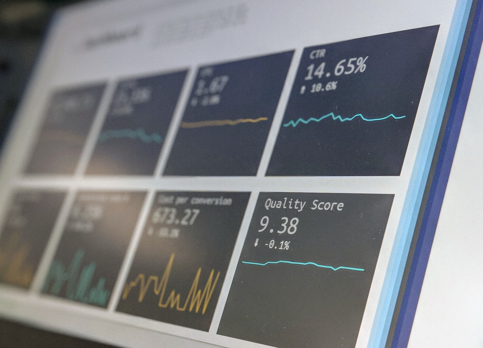
In this case, some sort of dashboard software is needed such that visualisations can be updated, created and deleted in real-time – preferably using a web interface. Furthermore, this can be used to create dashboards which can be shared with others.
This blog post covers three of the most widely used open source software which fit this mould. To be clear, when we mention service, we are referring to free and open source software which can either be hosted on-prem (using your own resources) or in the cloud as a paid service.
Apache Superset
Easy to use and lightweight
Apache Superset is described as a data exploration and visualisation platform written in Python which allows users to create interactive data visualisations using a variety of different data sources including MySQL, Postgres and even Google Sheets to list just a few. Superset is built using the Apache ECharts JavaScript library which supports a large range of different data visualisation types. The full list can be found here.
Grafana
Fast and easily customisable
Grafana is perhaps the best well-known system administrator for monitoring services such as server memory and CPU usage. That’s not to say that this is the only thing Grafana is useful for. Grafana has been used to visualise many other things too, such as the COVID-19 pandemic, energy usage and stock portfolio. There is also an active community of others who share their dashboards and add new features to the service making it as extensive as Apache Superset. Furthermore, Grafana is built using the Go programming language making it extremely fast and efficient to run cross-platform.
Kibana
Versatile but not beginner friendly
Elastic Kibana (also just known as Kibana) is another visualisation platform which is integrated with the Elasticsearch search engine. Much like Superset, Kibana supports many different ways to visualise data making it incredibly versatile, however, those who are unfamiliar with the way in which Elasticsearch is used may find this platform a little tricky to get going initially. It’s probably better suited to those who have used Elasticsearch before.
Conclusions
This blog post presents three platforms which can be used to build interactive dashboards for either yourself or your clients. Of the three presented in this blog post, there is no right or wrong option as all three have their merits.
My personal opinion is that if you wish to build something for clients, both Apache Superset and Kabana provide the most “WOW” in terms of visualisation types and ease of use however if you’re in the building dashboard for either yourself or a small team, Grafana would serve as a worthy alternative.
