In the previous post, we went through the process of how to collect data from Twitter (Via Twint) using a few key terms. We then used regular expressions to extract the relevant parts of the tweet containing the retweeted and/or mentioned user. In this post, we use Gephi to build a visual representation of the network as well as extracting a few essential network features to help explain some really important components.
A word of warning: My network contains around +270K users and +430K connections which is quite large! You’ll know it is large when your CPU fans kick in on max 😉
Loading in the Network
Conveniently, Gephi provides all the necessary tools for importing and exporting data of different types. For us, it’s a simple matter of importing a spreadsheet (or a CSV file in our case). For this example, I combined both retweets and mention connections into one graph. Ideally, for further analysis, you probably would want to split these into two groups for a more accurate representation.
To begin we can kick things off by importing a spreadsheet…
Depending on how many edges you have, you might find you encounter situations where a pair of nodes might have multiple edges. Thankfully, Gephi has what is known as a ‘merge strategy’ to handle conflicting edges. In my case, I just want to combine them using the ‘Sum’ option. There are other settings as well such as including missing nodes and self-loops (edges in which the source and target are the same)
The Data Visualisation
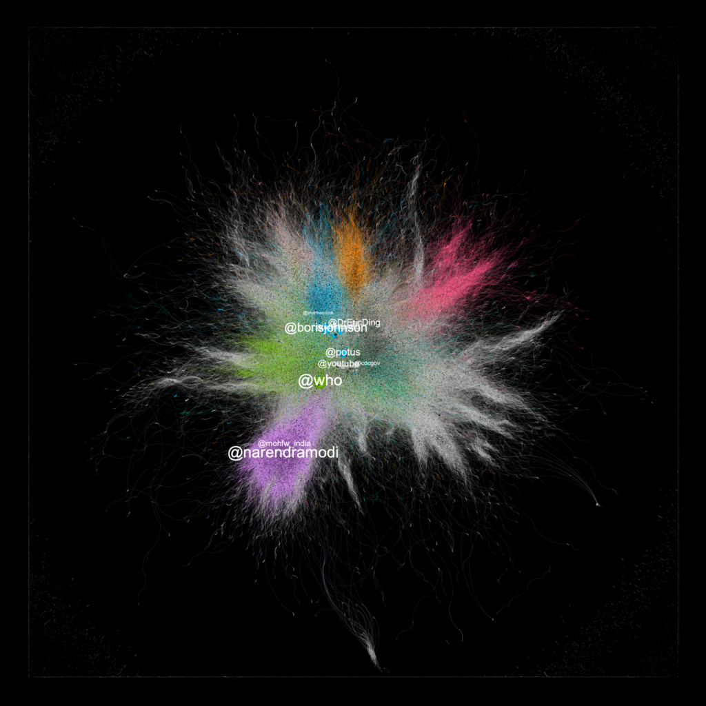
After tweaking with a few settings, I produced the following graph as the end result. I’ve also included a few usernames just to show which accounts are included in the network.
Observations
The colour of certain nodes in the network is determined by a feature known as modularity. In short, modularity is essentially a simple metric to summarise how well a network can be partitioned into groups. In our case quite well with a score of 0.821 – the closer to 1.0 it is, the easier it is to find clusters. The colours shown in the plot corresponds to groups which Gephi has estimated itself based upon the modularity metric. There are other clustering techniques that we can talk about later.
The size of the node is determined by the value of the node’s eigenvector centrality. This is a fancy metric to understand the influence that node has with respect to its neighbouring connections. It’s based upon a calculation that is determined by the number of inward and outward connections. Those with a relatively high eigenvector centrality are positioned in the ‘centre’ of the interactions. This feature comes in handy in a lot of situations and it’s widely used across many network-based applications such as the World Wide Web.
Using these features we can begin to understand a little bit more about the conversation surrounding the search terms we specified. In case you forgot, these are #COVID19 and the ‘Delta variant’.
The labels that are shown in the network were picked out manually as they had a relatively high eigenvector centrality and were worth presenting in the network. As shown, significant figures like the British Prime Minister, Boris Johnson and Matt Hancock (the then Health Secretary) tend to have a strong presence in the network. This potentially marks a conversation centred around Twitter users in the UK voicing their concerns about the pandemic with the rise in cases and the release of lockdown restrictions.
In addition to this, we also observe interactions that take place internationally too with the official WHO (World Health Organisation) Twitter account and @POTUS appearing in the centre. Towards the bottom, we see a collection of tweets sent to the Indian Prime Minister Narendra Modi. I would imagine this would appear because of the ongoing outbreak of COVID-19 within India.
All of these interactions are very interesting and this data visualisation really helps us to understand how communities around the world interact around one topic and with people in positions of great influence.
Other Useful Metrics
In this example, we’ve only used a few network-based metrics out of many. There are other features to which are more simplistic which we didn’t include. Here are just a few:
Degree
Simply put, degree is essentially the number of connections a node has. Depending on the type of network, if you’re using a direct network you can look at the number of outgoing connections and the number of incoming connections. This can be really helpful to understand how users interact with other users. Do they interact with others as much as others interact with them? This is also known as reciprocity.
Communities
Much like the real world, we tend to stick to certain groups of people and try and preserve connections with them. Communities can also be observed in social networks such as Twitter. For example, we can find groups of users who retweet from each other a lot or like each other’s content.
Diameters
If we wanted to see how large a network is, we can determine the diameter which returns the longest connected chain (or path) of users within the network. This may help us to gain perspective of how far a piece of content might spread if it becomes viral.
Conclusions
In this blog post, we briefly went through the process of importing data into Gephi and selecting simple metrics to present important characteristics of our network. We found out some really interesting outcomes in terms of how users in positions of leadership interact with the Twitter conversation at large. We also touched on a few alternative metrics which we can include in our network visualisation. Overall, these visualisations are really important for understanding how social networks operate and how ideas can spread within such a short space of time. Twitter is just one example of a social network and the same techniques can apply to so many different platforms.